Artemis Arts
February 2020
February 2020

Artemis Arts is a unique entity focused on empowering women arts professionals and their stories. Combining artistic instruction with professional development, personal support with exploration, and business insight with education; Artemis encourages female arts professionals to recognize their potential, embrace their ambition, and finally have their works fully recognized.
Born out of multiple phone calls of help, Artemis
Arts was created by theater professional Sam Hull.
Each phone call came from a former student of
his as they spoke about the lack of work in their
careers. As phone calls began to pile up, Hull
began to help his former students one-by-one with undivided attention. From this, Hull realized
that many female artists were unable to kick
off their careers due to sexist biases in th art world. With this in mind, he created the
non-profit organization to help support women
around the world.
The brand strategy for Artemis Arts is about unifying the various aspects of the non-profit organization. The goal was to find how Artemis Arts communicates protection and support with the Greek goddess of the same name. With much insight into the lore of Artemis and the mission of the non-profit organization, it is found that both are motivated to protect those in the dark.
The brand strategy for Artemis Arts is about unifying the various aspects of the non-profit organization. The goal was to find how Artemis Arts communicates protection and support with the Greek goddess of the same name. With much insight into the lore of Artemis and the mission of the non-profit organization, it is found that both are motivated to protect those in the dark.

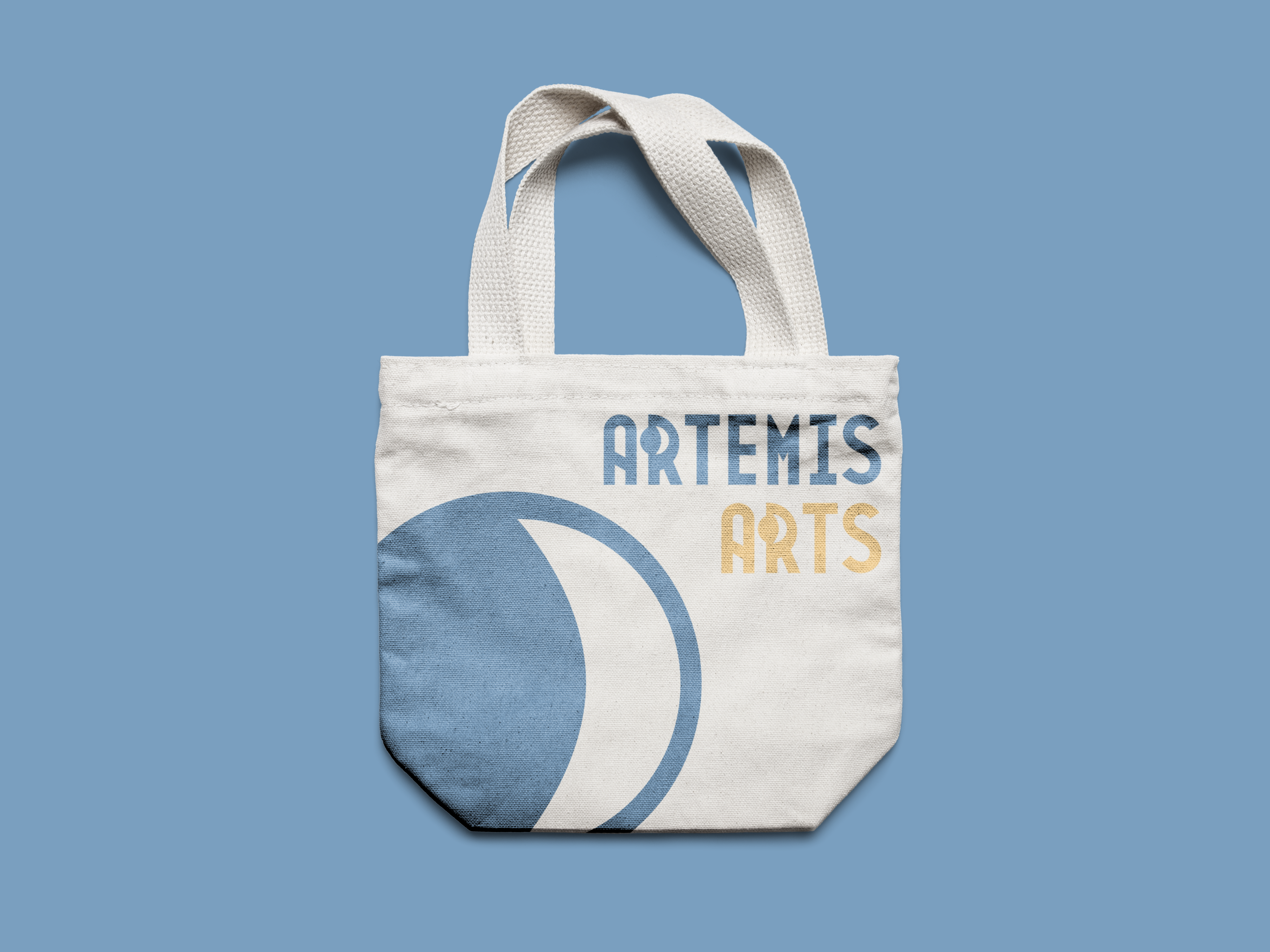
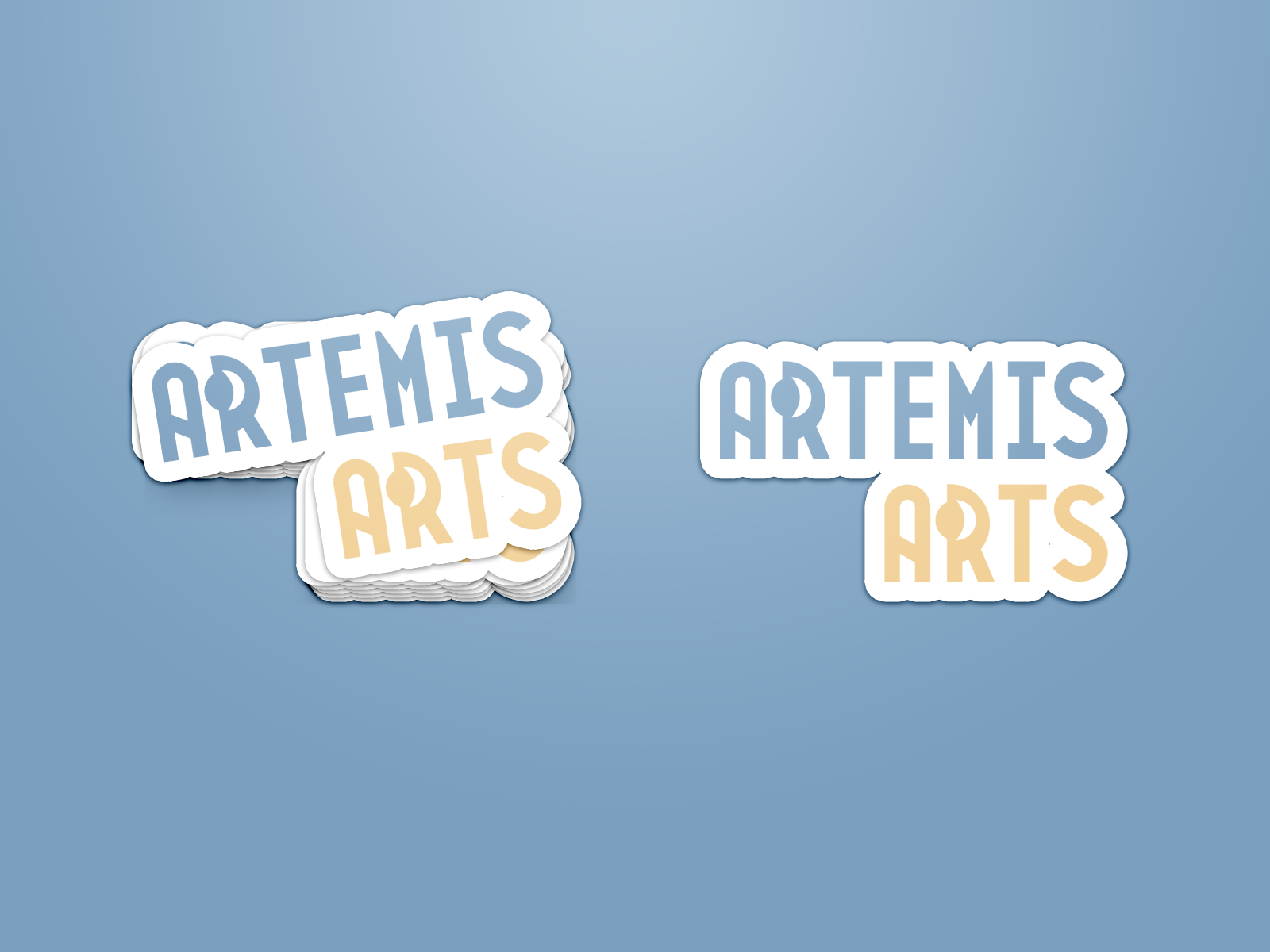
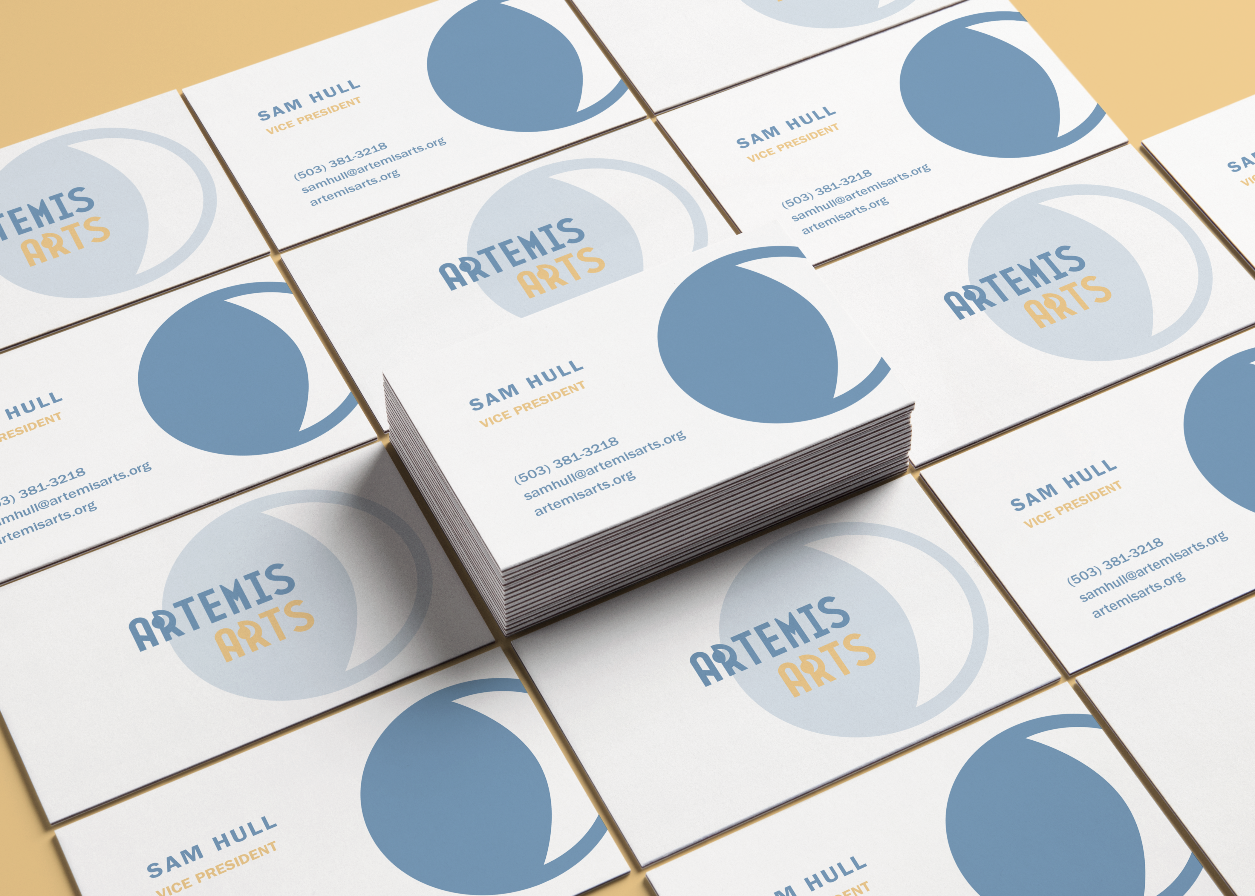
The mark for Artemis Arts visually communicates Art Deco style and elements of Greek mythology.
The decorative type borrows from the geometric shapes of the famous 1920s art movement. The reason for choosing for an Art Deco style is that it represents the time of women’s right to vote. Simply, this style is used to pay tribute to the historic, fighting women.
Within the counter of the R’s, there is a symbol of the Greek goddess, Artemis. Traditionally, Artemis is known as the goddess of the moon It is said that Artemis protected hunters in the night by using the light of the moon. In this rebrand, the moon represents women supporting women who are in the dark within the art industry.
Overall, this new image pays tribute to iconic women in the past as we help support women for the future of the arts.
The colors of the rebrand combine the ideas of nature and femininity.
Each color was chosen based on what is most commonly seen in nature. The reason why nature was chosen is because Artemis is known as the goddess of hunting and nature. The blue represents water and the moon. The yellow represents light that comes from the sun and moon. The green represents the Earth that houses to hunters Artemis protected.
Feminity is communicated through the value of each color. The colors were lightened to bring light values. Through these, the colors bring a sense of softness that often gets associated with women.